|
Matplotlib - 2D Graph
Matplotlib 2D Graph is pretty similar to Matlab 2D Plot in terms of syntax and functionality. If you are familiar with Matlab 2D plot, it would be easier to learn Matplotlib plot. But I noticed Matplotlib has many more functionalities that are not supported by Matlab.
NOTE : To use matplotlib you need to install matplotlib package first. For the package installation, refer to here.
plot
There are two ways of plotting, one with default pyplot object and the other one with axes object. If you are familiar with matlab plot functions, you may not need to learn anything new for the default pyplot object. Plotting with axes object would require a little bit more extra steps but it would be more flexible in terms of defining the plotting area in the figure window etc. When
I first started using matplotlib, I mostly used the default pyplot object since the syntax and concept is almost same as Matlab that I am already used to but I get to turn more to axes object due to the extra flexibility.
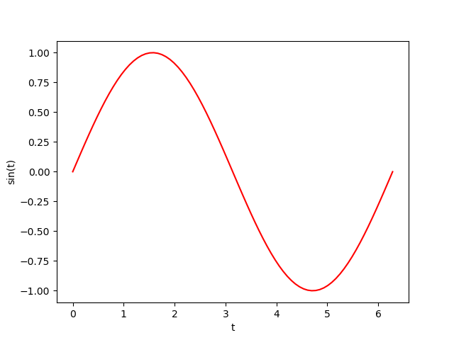
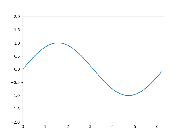
plot with default pyplot
|
import matplotlib.pyplot as plt
import numpy as np
pi = np.pi;
t = np.linspace(0,2*pi,80);
plt.plot(t,np.sin(t),'r-')
plt.xlabel('t')
plt.ylabel('sin(t)')
plt.show();
|
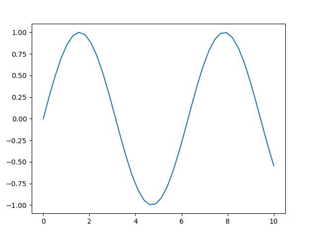
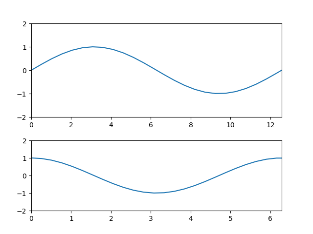
plot with axes
|
import matplotlib.pyplot as plt
import numpy as np
fig = plt.figure()
rect1 = [0.1, 0.1, 0.8, 0.8];
ax1 = fig.add_axes(rect1);
t = np.linspace(0, 10, 40)
ax1.plot(t,np.sin(t))
fig.show()
|
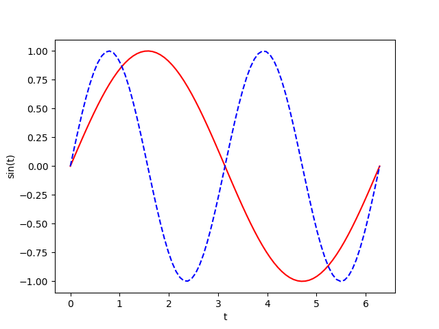
multiple graphs in single plot
|
import matplotlib.pyplot as plt
import numpy as np
pi = np.pi;
t = np.linspace(0,2*pi,80);
plt.plot(t,np.sin(t),'r-',t,np.sin(2*t),'b--')
plt.xlabel('t')
plt.ylabel('sin(t)')
plt.show();
|
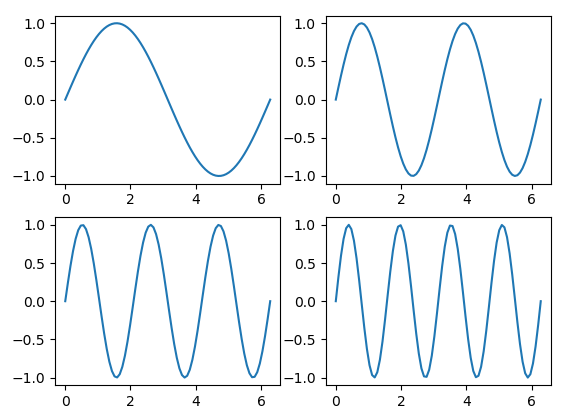
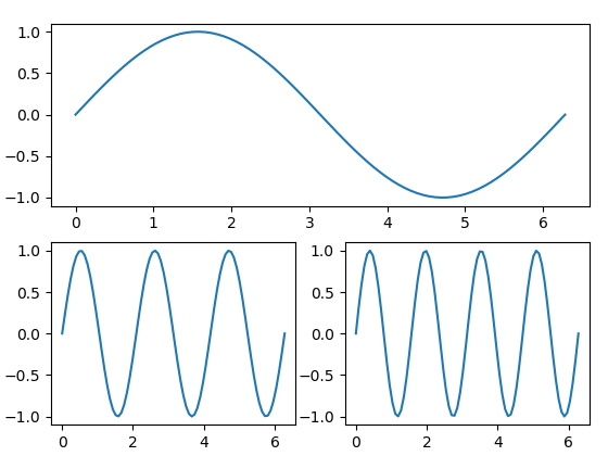
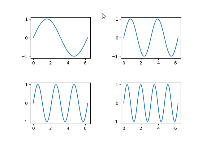
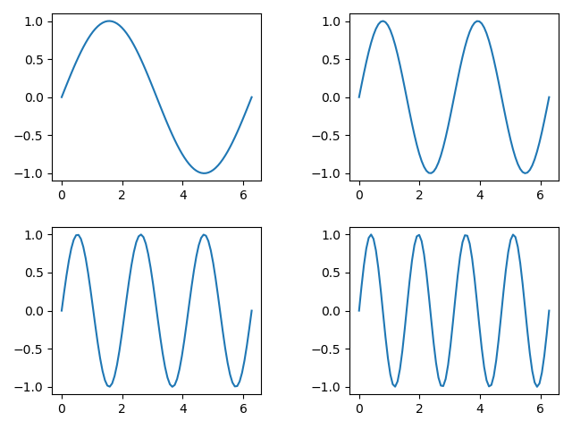
subplot
subplot with same size
|
import matplotlib.pyplot as plt
import numpy as np
pi = np.pi;
t = np.linspace(0,2*pi,80);
plt.subplot(2,2,1);
plt.plot(t,np.sin(t));
plt.subplot(2,2,2);
plt.plot(t,np.sin(2*t));
plt.subplot(2,2,3);
plt.plot(t,np.sin(3*t));
plt.subplot(2,2,4);
plt.plot(t,np.sin(4*t));
plt.show();
|
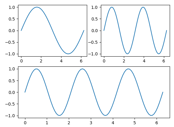
subplot with different size
|
import matplotlib.pyplot as plt
import numpy as np
pi = np.pi;
t = np.linspace(0,2*pi,80);
plt.subplot(2,1,1);
plt.plot(t,np.sin(t));
plt.subplot(2,2,3);
plt.plot(t,np.sin(3*t));
plt.subplot(2,2,4);
plt.plot(t,np.sin(4*t));
plt.show();
|
|
import matplotlib.pyplot as plt
import numpy as np
pi = np.pi;
t = np.linspace(0,2*pi,80);
plt.subplot(2,2,1);
plt.plot(t,np.sin(t));
plt.subplot(2,2,2);
plt.plot(t,np.sin(2*t));
plt.subplot(2,1,2);
plt.plot(t,np.sin(3*t));
plt.show();
|
spacing between subplots
|
import matplotlib.pyplot as plt
import numpy as np
pi = np.pi;
t = np.linspace(0,2*pi,80);
plt.subplot(2,2,1);
plt.plot(t,np.sin(t));
plt.subplot(2,2,2);
plt.plot(t,np.sin(2*t));
plt.subplot(2,2,3);
plt.plot(t,np.sin(3*t));
plt.subplot(2,2,4);
plt.plot(t,np.sin(4*t));
plt.tight_layout(pad=4.0)
plt.show();
|
|
import matplotlib.pyplot as plt
import numpy as np
pi = np.pi;
t = np.linspace(0,2*pi,80);
plt.subplot(2,2,1);
plt.plot(t,np.sin(t));
plt.subplot(2,2,2);
plt.plot(t,np.sin(2*t));
plt.subplot(2,2,3);
plt.plot(t,np.sin(3*t));
plt.subplot(2,2,4);
plt.plot(t,np.sin(4*t));
plt.tight_layout(w_pad=4.0, h_pad = 2)
plt.show();
|
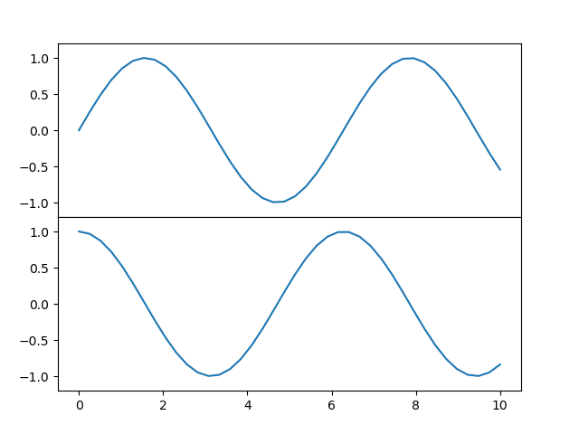
Multiplot with multiple axis
multiplot with same size
|
import matplotlib.pyplot as plt
import numpy as np
fig = plt.figure()
rect1 = [0.1, 0.5, 0.8, 0.4];
rect2 = [0.1, 0.1, 0.8, 0.4];
ax1 = fig.add_axes(rect1,
xticklabels=[], ylim=(-1.2, 1.2))
ax2 = fig.add_axes(rect2,
ylim=(-1.2, 1.2))
t = np.linspace(0, 10, 40)
ax1.plot(t,np.sin(t))
ax2.plot(t,np.cos(t));
fig.show()
|
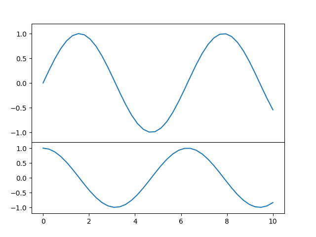
Multiplot with difference size
|
import matplotlib.pyplot as plt
import numpy as np
fig = plt.figure()
rect1 = [0.1, 0.4, 0.8, 0.5];
rect2 = [0.1, 0.1, 0.8, 0.3];
ax1 = fig.add_axes(rect1,
xticklabels=[], ylim=(-1.2, 1.2))
ax2 = fig.add_axes(rect2,
ylim=(-1.2, 1.2))
t = np.linspace(0, 10, 40)
ax1.plot(t,np.sin(t))
ax2.plot(t,np.cos(t));
fig.show()
|
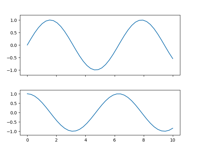
Multiplot with Arbitrary Size
|
import matplotlib.pyplot as plt
import numpy as np
fig = plt.figure()
rect1 = [0.1, 0.5, 0.8, 0.4];
rect2 = [0.1, 0.1, 0.8, 0.3];
ax1 = fig.add_axes(rect1,
xticklabels=[], ylim=(-1.2, 1.2))
ax2 = fig.add_axes(rect2,
ylim=(-1.2, 1.2))
t = np.linspace(0, 10, 40)
ax1.plot(t,np.sin(t))
ax2.plot(t,np.cos(t));
fig.show()
|
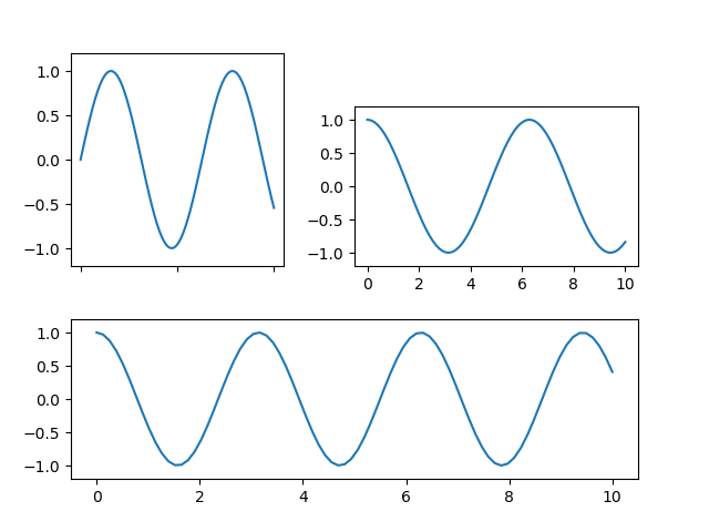
|
fig = plt.figure()
rect1 = [0.1, 0.5, 0.3, 0.4];
rect2 = [0.5, 0.5, 0.4, 0.3];
rect3 = [0.1, 0.1, 0.8, 0.3];
ax1 = fig.add_axes(rect1,
xticklabels=[], ylim=(-1.2, 1.2))
ax2 = fig.add_axes(rect2,
ylim=(-1.2, 1.2))
ax3 = fig.add_axes(rect3,
ylim=(-1.2, 1.2))
t = np.linspace(0, 10, 80)
|
Setting the size of a figure window
Setting the size with figure( )
You can set the size of the figure when you creates a figure.
|
import matplotlib.pyplot as plt
import numpy as np
fig = plt.figure(figsize=[8,4]) # the size is configured in inches
rect1 = [0.1, 0.4, 0.8, 0.5];
rect2 = [0.1, 0.1, 0.8, 0.3];
ax1 = fig.add_axes(rect1,
xticklabels=[], ylim=(-1.2, 1.2))
ax2 = fig.add_axes(rect2,
ylim=(-1.2, 1.2))
t = np.linspace(0, 10, 40)
ax1.plot(t,np.sin(t))
ax2.plot(t,np.cos(t));
fig.show()
|
Setting the size with gcf()
or you can change the size of the figure after a figure is created.
|
import matplotlib.pyplot as plt
import numpy as np
fig = plt.figure()
rect1 = [0.1, 0.4, 0.8, 0.5];
rect2 = [0.1, 0.1, 0.8, 0.3];
ax1 = fig.add_axes(rect1,
xticklabels=[], ylim=(-1.2, 1.2))
ax2 = fig.add_axes(rect2,
ylim=(-1.2, 1.2))
t = np.linspace(0, 10, 40)
ax1.plot(t,np.sin(t))
ax2.plot(t,np.cos(t));
plt.gcf().set_size_inches(8, 4) # changes figure size in inches
fig.show()
|
Setting x,y range
Setting x,y range for plt plot
The way to set x,y range is slighly different depending on how you plot.
|
import numpy as np
import matplotlib.pyplot as plt
x = np.arange(0, 2*np.pi, 0.1);
y = np.sin(x);
plt.plot(x, y)
plt.xlim([0,2*np.pi]);
plt.ylim([-2,2]);
plt.show()
|
Setting x, y range for axes plot
|
import matplotlib.pyplot as plt
import numpy as np
fig = plt.figure()
rect1 = [0.1, 0.5, 0.8, 0.4];
rect2 = [0.1, 0.1, 0.8, 0.3];
ax1 = fig.add_axes(rect1)
ax1.set_xlim([0,4*np.pi]);
ax1.set_ylim([-2,2]);
ax2 = fig.add_axes(rect2)
ax2.set_xlim([0,2*np.pi]);
ax2.set_ylim([-2,2]);
t = np.linspace(0, 10, 40)
ax1.plot(2*t,np.sin(t))
ax2.plot(t,np.cos(t));
fig.show()
|
Formatting Axis Tick Label
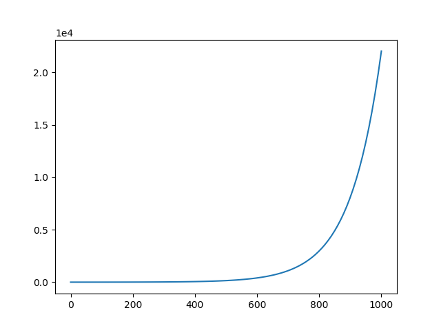
Formatting Number in Scientific format
|
import numpy as np
import matplotlib.pyplot as plt
x = np.linspace(0,1000,100);
plt.plot(x,np.exp(0.01*x));
plt.ticklabel_format(axis="y", style="sci", scilimits=(0,0))
plt.show()
|
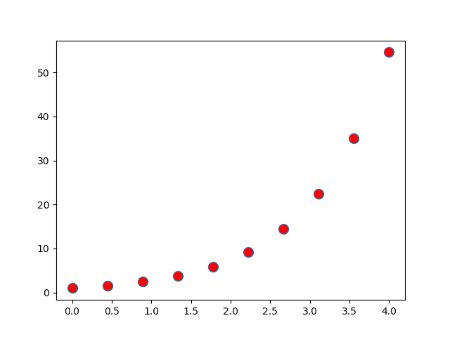
Marker Format - Color, Size etc
Marker Format - Size, Face Color
|
import numpy as np
import matplotlib.pyplot as plt
x = np.linspace(0,4,10);
plt.plot(x,np.exp(x),'o',
markersize=10,
markerfacecolor='red');
plt.show()
|
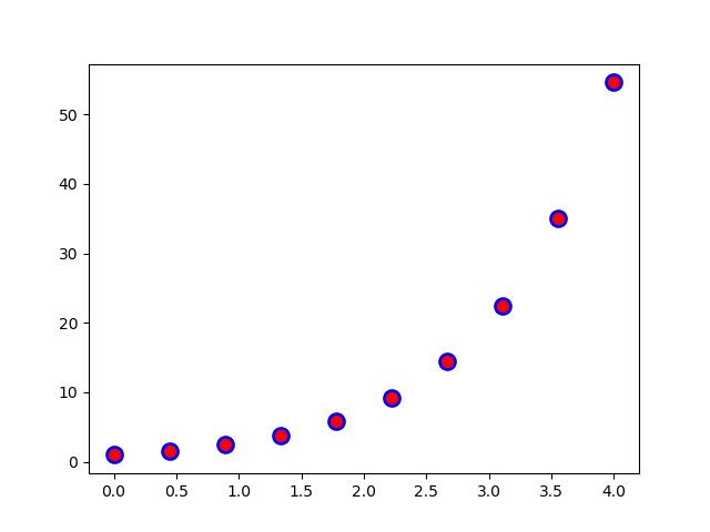
Marker Format - Edge Color, Edge Width
|
import numpy as np
import matplotlib.pyplot as plt
x = np.linspace(0,4,10);
plt.plot(x,np.exp(x),'o',
markersize=10,
markerfacecolor='red',
markeredgecolor='blue',
markeredgewidth=2);
plt.show()
|
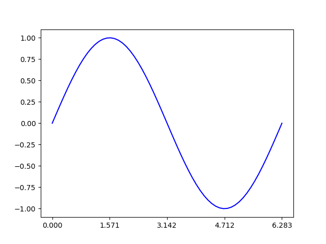
Ticks and Tick Labels
Setting User Defined Tikcs
|
import numpy as np
import matplotlib.pyplot as plt
pi = np.pi;
x = np.linspace(0,2*np.pi,60);
plt.plot(x,np.sin(x),'b-');
plt.xticks(ticks=[0,0.5*pi,pi,1.5*pi,2*pi]);
plt.show()
|
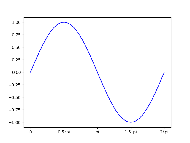
Setting User Defined Tick Label
|
import numpy as np
import matplotlib.pyplot as plt
pi = np.pi;
x = np.linspace(0,2*np.pi,60);
plt.plot(x,np.sin(x),'b-');
plt.xticks(ticks=[0,0.5*pi,pi,1.5*pi,2*pi],labels=["0","0.5*pi","pi","1.5*pi","2*pi"]);
plt.show()
|
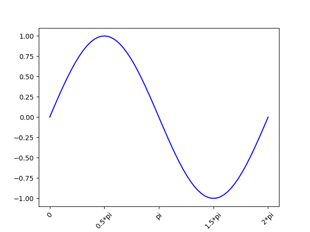
Rotating Tick Label Text
|
import numpy as np
import matplotlib.pyplot as plt
pi = np.pi;
x = np.linspace(0,2*np.pi,60);
plt.plot(x,np.sin(x),'b-');
plt.xticks(ticks=[0,0.5*pi,pi,1.5*pi,2*pi],labels=["0","0.5*pi","pi","1.5*pi","2*pi"]);
plt.xticks(rotation=45);
plt.show()
|
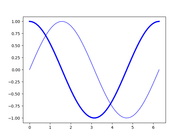
Line Thicknenss
|
import numpy as np
import matplotlib.pyplot as plt
pi = np.pi;
x = np.linspace(0,2*np.pi,60);
plt.plot(x,np.sin(x),'b-',linewidth = 1);
plt.plot(x,np.cos(x),'b-',linewidth = 3);
plt.show()
|
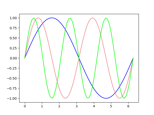
Line Color
|
import numpy as np
import matplotlib.pyplot as plt
pi = np.pi;
x = np.linspace(0,2*np.pi,60);
plt.plot(x,np.sin(x),'b-');
plt.plot(x,np.sin(2*x),color='lightcoral');
plt.plot(x,np.sin(3*x),color='#00FF00');
plt.show()
|
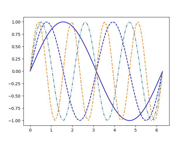
Line Style
|
import numpy as np
import matplotlib.pyplot as plt
pi = np.pi;
x = np.linspace(0,2*np.pi,60);
plt.plot(x,np.sin(x),'b-');
plt.plot(x,np.sin(2*x),'b--');
plt.plot(x,np.sin(3*x),linestyle=(0,(5,2,1,2))); # (offset,(0n,Off,On,Off))
plt.plot(x,np.sin(4*x),linestyle=(10,(5,2,3,2))); # (offset,(0n,Off,On,Off))
plt.show()
|
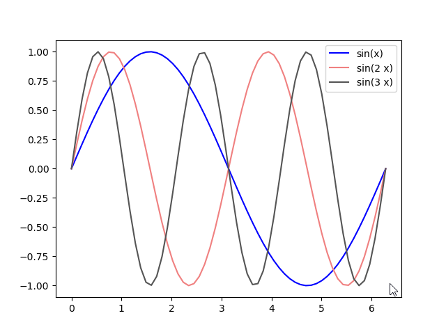
Legend
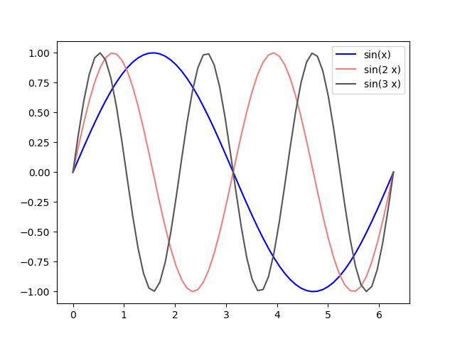
Legend - Default
Adding a legend is simple.. it is just call legend(), but you should specify the label for each plot and that label will appear in the legend box.
|
import numpy as np
import matplotlib.pyplot as plt
pi = np.pi;
x = np.linspace(0,2*np.pi,60);
plt.plot(x,np.sin(x),'b-',label='sin(x)');
plt.plot(x,np.sin(2*x),color='lightcoral',label='sin(2 x)');
plt.plot(x,np.sin(3*x),color='#555555',label='sin(3 x)');
plt.legend();
plt.show()
|
Legend with specified label
|
import numpy as np
import matplotlib.pyplot as plt
pi = np.pi;
x = np.linspace(0,2*np.pi,60);
plt.plot(x,np.sin(x),'b-');
plt.plot(x,np.sin(2*x),color='lightcoral');
plt.plot(x,np.sin(3*x),color='#555555');
plt.legend(['sin(x)', 'sin(2 x)', 'sin(3 x)']);
plt.show()
|
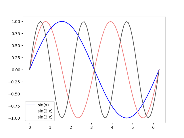
Legend at the specified location
|
import numpy as np
import matplotlib.pyplot as plt
pi = np.pi;
x = np.linspace(0,2*np.pi,60);
plt.plot(x,np.sin(x),'b-');
plt.plot(x,np.sin(2*x),color='lightcoral');
plt.plot(x,np.sin(3*x),color='#555555');
plt.legend(['sin(x)', 'sin(2 x)', 'sin(3 x)'], loc = 'lower left');
plt.show()
|
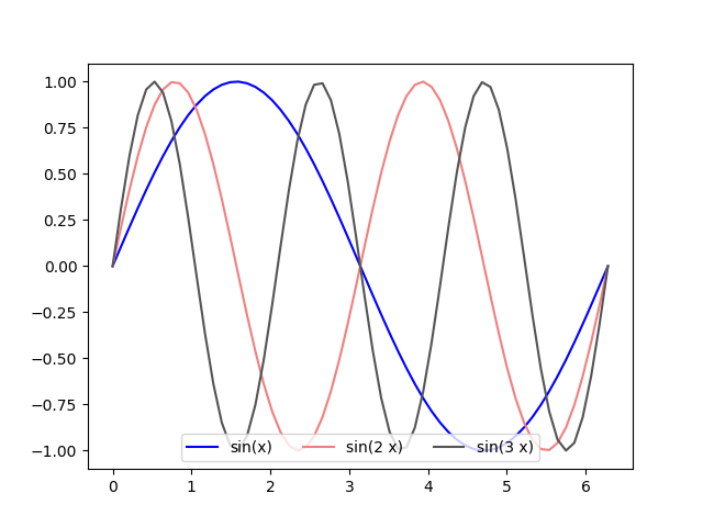
Legend - Horizontal Direction
|
import numpy as np
import matplotlib.pyplot as plt
pi = np.pi;
x = np.linspace(0,2*np.pi,60);
plt.plot(x,np.sin(x),'b-');
plt.plot(x,np.sin(2*x),color='lightcoral');
plt.plot(x,np.sin(3*x),color='#555555');
plt.legend(['sin(x)', 'sin(2 x)', 'sin(3 x)'], loc = 'lower center', ncol = 3);
plt.show()
|
Turning Off Frame
|
import matplotlib.pyplot as plt
import numpy as np
fig = plt.figure()
rect1 = [0.1, 0.1, 0.8, 0.8];
ax1 = fig.add_axes(rect1);
t = np.linspace(0, 10, 40)
ax1.plot(t,np.sin(t))
ax1.set(frame_on=False)
ax1.set_xticks([]);
ax1.set_yticks([]);
fig.show()
|
|
import matplotlib.pyplot as plt
import numpy as np
t = np.linspace(0, 10, 40)
plt.plot(t,np.sin(t))
plt.box(False);
plt.xticks([]);
plt.yticks([]);
plt.show()
|
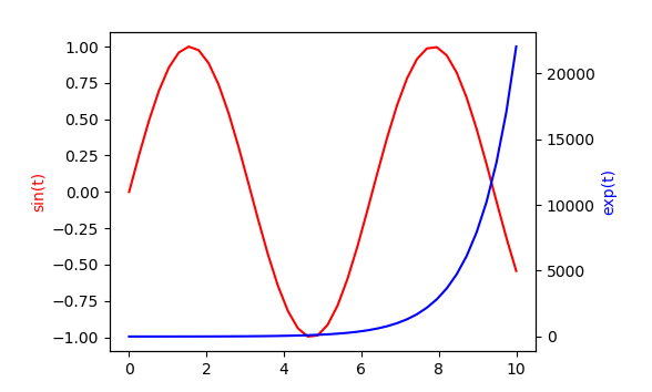
Adding Secondary Axis
|
import matplotlib.pyplot as plt
import numpy as np
fig = plt.figure()
rect1 = [0.2, 0.2, 0.6, 0.6];
ax1 = fig.add_axes(rect1);
t = np.linspace(0, 10, 40)
ax1.plot(t,np.sin(t), 'r-')
ax1.set_ylabel('sin(t)',color='red');
ax2 = ax1.twinx();
ax2.plot(t,np.exp(t), 'b-');
ax2.set_ylabel('exp(t)',color='blue');
fig.show()
|
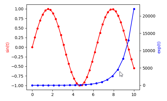
|
import matplotlib.pyplot as plt
import numpy as np
fig = plt.figure()
rect1 = [0.2, 0.2, 0.6, 0.6];
ax1 = fig.add_axes(rect1);
t1 = np.linspace(0, 10, 40)
t2 = np.linspace(0, 10, 20)
ax1.plot(t1,np.sin(t1), 'r-')
ax1.scatter(t1,np.sin(t1), s = 16, c = 'red');
ax1.set_ylabel('sin(t)',color='red');
ax2 = ax1.twinx();
ax2.plot(t2,np.exp(t2), 'b-');
ax2.scatter(t2,np.exp(t2), s = 16, c = 'blue');
ax2.set_ylabel('exp(t)',color='blue');
fig.show()
|
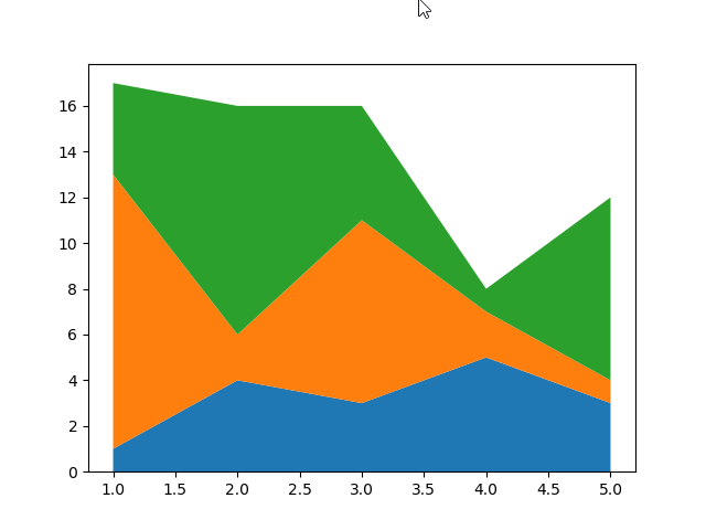
Stacked Plot
Stacked Plot - Default
|
import numpy as np
import matplotlib.pyplot as plt
y1 = [1,4,3,5,3];
y2 = [12,2,8,2,1];
y3 = [4,10,5,1,8];
x=range(1,6);
plt.stackplot(x,[y1,y2,y3]);
plt.show();
|
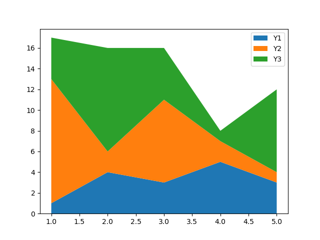
Stacked Plot with Legend
|
import numpy as np
import matplotlib.pyplot as plt
y1 = [1,4,3,5,3];
y2 = [12,2,8,2,1];
y3 = [4,10,5,1,8];
x=range(1,6);
plt.stackplot(x,[y1,y2,y3],labels=['Y1','Y2','Y3']);
plt.legend(loc='upper right')
plt.show();
|
Histogram
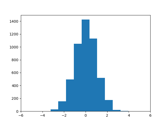
Histogram with frequencies / Default Bins
|
import matplotlib.pyplot as plt
import numpy as np
from numpy.random import seed
from numpy.random import randn
seed(1)
r = randn(5000);
plt.hist(r);
plt.xlim([-6,6]);
plt.show();
|
Histogram with frequencies / User defined bins
|
import matplotlib.pyplot as plt
import numpy as np
from numpy.random import seed
from numpy.random import randn
seed(1)
r = randn(5000);
bins = np.linspace(-6,6,50);
plt.hist(r,bins);
plt.xlim([-6,6]);
plt.show();
|
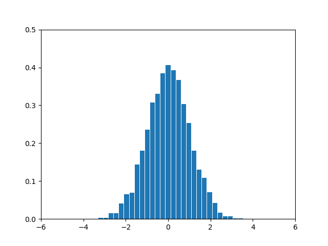
Histogram with probability desity
|
import matplotlib.pyplot as plt
import numpy as np
from numpy.random import seed
from numpy.random import randn
seed(1)
r = randn(5000);
bins = np.linspace(-6,6,50);
plt.hist(r,bins,density=True);
plt.xlim([-6,6]);
plt.show();
|

Histogram - Constrolling Bar Spacing
|
import matplotlib.pyplot as plt
import numpy as np
from numpy.random import seed
from numpy.random import randn
seed(1)
r = randn(5000);
bins = np.linspace(-6,6,50);
plt.hist(r,bins,rwidth=0.9,density=True);
plt.xlim([-6,6]);
plt.show();
|
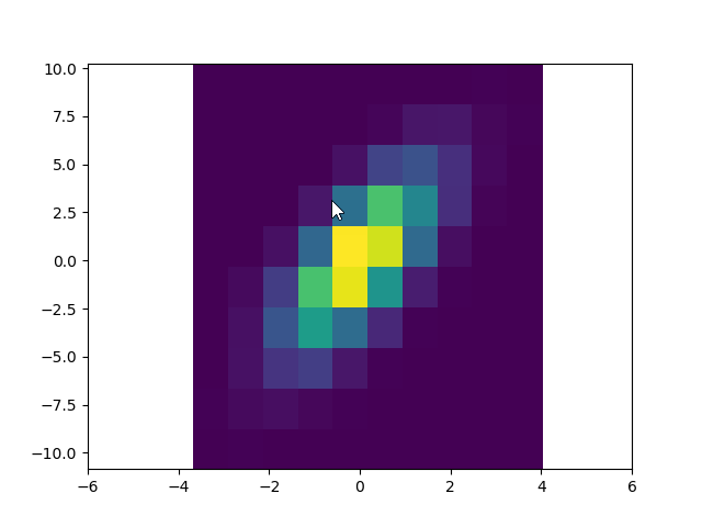
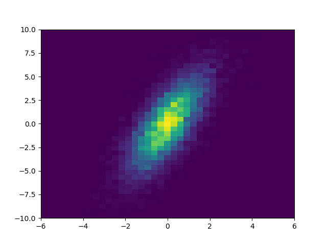
Histogram 2D
Histogram 2D - Default
|
import matplotlib.pyplot as plt
import numpy as np
from numpy.random import seed
from numpy.random import randn
seed(1)
x = randn(10000);
y = 2 * x + 2*randn(10000);
plt.hist2d(x,y);
plt.xlim([-6,6]);
plt.show();
|
Histogram 2D - x, y bins
|
import matplotlib.pyplot as plt
import numpy as np
from numpy.random import seed
from numpy.random import randn
seed(1)
x = randn(10000);
y = 2 * x + 2*randn(10000);
xbin = np.linspace(-6,6,40);
ybin = np.linspace(-10,10,40);
plt.hist2d(x,y,bins=[xbin,ybin]);
plt.xlim([-6,6]);
plt.show();
|
Histogram 2D - Probability Density
|
import matplotlib.pyplot as plt
import numpy as np
from numpy.random import seed
from numpy.random import randn
seed(1)
x = randn(10000);
y = 2 * x + 2*randn(10000);
xbin = np.linspace(-6,6,40);
ybin = np.linspace(-10,10,40);
plt.hist2d(x,y,bins=[xbin,ybin],density=True);
plt.xlim([-6,6]);
plt.show();
|

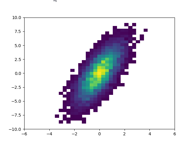
Histogram 2D - Setting the lower boundary
|
import matplotlib.pyplot as plt
import numpy as np
from numpy.random import seed
from numpy.random import randn
seed(1)
x = randn(10000);
y = 2 * x + 2*randn(10000);
xbin = np.linspace(-6,6,40);
ybin = np.linspace(-10,10,40);
plt.hist2d(x,y,bins=[xbin,ybin],density=True, cmin = 0.001);
plt.xlim([-6,6]);
plt.show();
|
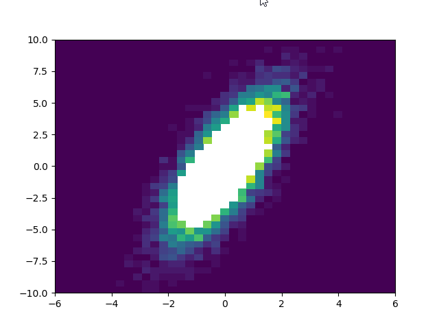
Histogram 2D - Setting the upper boundary
|
import matplotlib.pyplot as plt
import numpy as np
from numpy.random import seed
from numpy.random import randn
seed(1)
x = randn(10000);
y = 2 * x + 2*randn(10000);
xbin = np.linspace(-6,6,40);
ybin = np.linspace(-10,10,40);
plt.hist2d(x,y,bins=[xbin,ybin],density=True, cmax = 0.02);
plt.xlim([-6,6]);
plt.show();
|
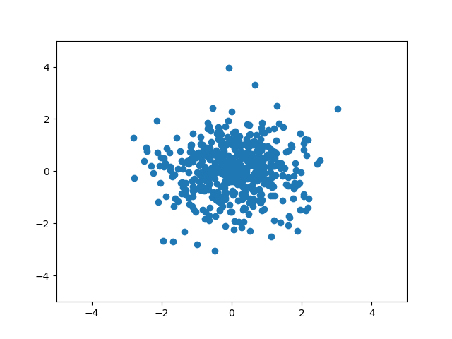
Scatter Plot
Scatter Plot - Default
|
import matplotlib.pyplot as plt
import numpy as np
from numpy.random import seed
from numpy.random import randn
seed(1)
x = randn(500);
y = randn(500);
plt.scatter(x,y);
plt.xlim([-5,5]);
plt.ylim([-5,5]);
plt.show();
|
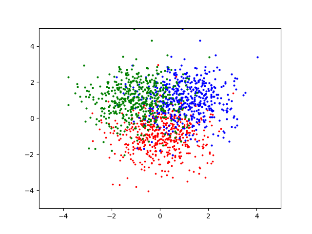
Scatter Plot - Setting Marker Color
|
import matplotlib.pyplot as plt
import numpy as np
from numpy.random import seed
from numpy.random import randn
seed(1)
x = randn(500);
y = randn(500);
plt.scatter(x,y-1,s=3,c='red');
plt.scatter(x+1,y+1,s=4,c='blue');
plt.scatter(x-1,y+1,s=4,c='green');
plt.xlim([-5,5]);
plt.ylim([-5,5]);
plt.show();
|
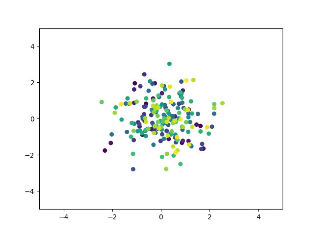
Scatter Plot - Setting Marker Size
|
import matplotlib.pyplot as plt
import numpy as np
from numpy.random import seed
from numpy.random import randn
seed(1)
x = randn(200);
y = randn(200);
z = range(200);
plt.scatter(x,y,s=30,c=z);
plt.xlim([-5,5]);
plt.ylim([-5,5]);
plt.show();
|
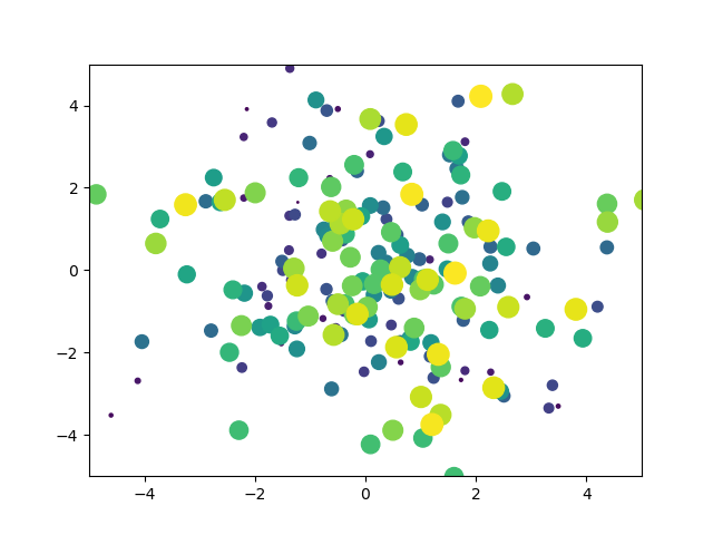
|
import matplotlib.pyplot as plt
import numpy as np
from numpy.random import seed
from numpy.random import randn
seed(1)
x = randn(200);
y = randn(200);
z = range(200);
plt.scatter(2*x,2*y,s=z,c=z);
plt.xlim([-5,5]);
plt.ylim([-5,5]);
plt.show();
|
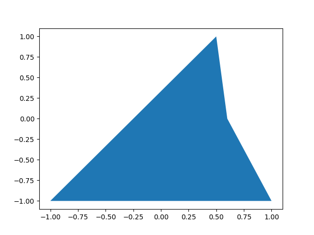
Filled Polygon
Filled Polygon - Default
|
import matplotlib.pyplot as plt
px = [-1.0, 0.5, 0.6, 1.0];
py = [-1.0, 1.0, 0.0, -1.0];
plt.fill(px,py);
plt.show();
|
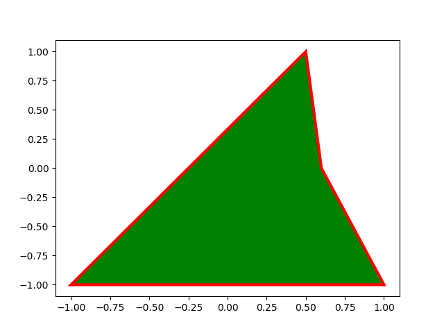
Filled Polygon - Face Color, Line Color, LineWidth
|
import matplotlib.pyplot as plt
px = [-1.0, 0.5, 0.6, 1.0];
py = [-1.0, 1.0, 0.0, -1.0];
plt.fill(px,py,facecolor='green', edgecolor='red', linewidth=3);
plt.show();
|
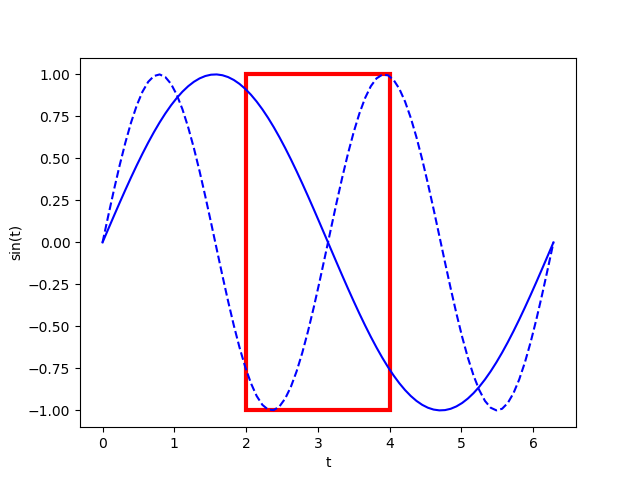
Filled Polygon - No Fill
|
import matplotlib.pyplot as plt
import numpy as np
px = [2.0, 2.0, 4.0, 4.0];
py = [-1.0, 1.0, 1.0, -1.0];
pi = np.pi;
t = np.linspace(0,2*pi,80);
plt.plot(t,np.sin(t),'b-',t,np.sin(2*t),'b--')
plt.fill(px,py,facecolor='none', edgecolor='red', linewidth=3);
plt.xlabel('t')
plt.ylabel('sin(t)')
plt.show();
|
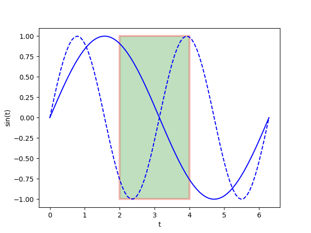
Filled Polygon - Transparency
|
import matplotlib.pyplot as plt
import numpy as np
px = [2.0, 2.0, 4.0, 4.0];
py = [-1.0, 1.0, 1.0, -1.0];
pi = np.pi;
t = np.linspace(0,2*pi,80);
plt.plot(t,np.sin(t),'b-',t,np.sin(2*t),'b--')
plt.fill(px,py,facecolor='green', edgecolor='red', linewidth=3, alpha = 0.25);
plt.xlabel('t')
plt.ylabel('sin(t)')
plt.show();
|
Reference :
[1] Matplotlib tutorial (Nicolas P. Rougier)
|
|